The Psychology of Colour: How to Choose the Perfect Palette for Deep Sleep
*This is a collaborative post.
Could the colour on your bedroom walls be the primary reason you are not sleeping well?
A landmark study by Travelodge revealed that individuals sleeping in blue-coloured bedrooms averaged nearly eight hours of restful sleep per night. That is a massive finding — and it points to a physiological design variable that many of us entirely overlook when redecorating.
Your bedroom colour palette has a very real, measurable impact on your sleep latency, overnight heart rate, and emotional well-being. Certain spectrum wavelengths can actually lower your blood pressure and soothe an overstimulated nervous system, making it much easier to drift off.
This guide breaks down the clinical psychology behind the best bedroom colours for sleep, explores what the scientific research says, and outlines exactly how to layer these tones to create your ultimate sleep sanctuary.
The Science of Colour and Your Brain
Colour influences your psychological state far more than you might realise. Human emotional responses to the visual spectrum are driven by a mix of deep biological evolution and learned cultural associations.
Hue, Saturation, and Brightness
Every colour carries three core attributes that dictate its sensory impact: hue (the colour family), saturation (the intensity of the pigment), and brightness (how much light it reflects).
- Warm Tones: High-saturation reds, oranges, and vivid yellows trigger high emotional arousal. They stimulate adrenaline, increase alertness, and keep the brain active.
- Cool Tones: Muted blues, greens, and soft lavenders recede visually from the eye. They evoke low emotional arousal, signalling security, calm, and physical rest.
- Retinal Efficiency: Interestingly, the cone cells in your retina are most sensitive to green light. Because green wavelengths require the least amount of ocular energy consumption to process, they cause the lowest retinal fatigue, allowing your eyes to rest completely before sleep.
💡 The Saturation Rule: If you are torn between two paint swatches, always lean toward the softer, less saturated version. The more muted and chalky the tone, the less visual processing your brain has to perform at bedtime.
What the Clinical Research Shows
If you rate your nightly sleep quality as “average” or “poor,” your wall decor choices may be actively working against your internal clock.

Pictured: A serene master bedroom featuring flat matte pastel blue walls. A minimalist light grey upholstered bed frame sits on a plush white wool rug. Soft morning sunlight filters through sheer linen drapes.
Multiple sleep studies highlight the direct correlation between wall pigmentation and sleep duration:
| Bedroom Colour | Average Nightly Sleep | Impact on Sleep Latency & Physiology |
|---|---|---|
| Muted Blue | 7 hours, 52 minutes | Retinal ganglion cells transmit blue wavelengths to lower blood pressure, slow respiration, and decrease heart rate. |
| Soft Yellow | 7 hours, 40 minutes | Creates a subconscious sense of gentle warmth and relaxation, reassuring the nervous system. |
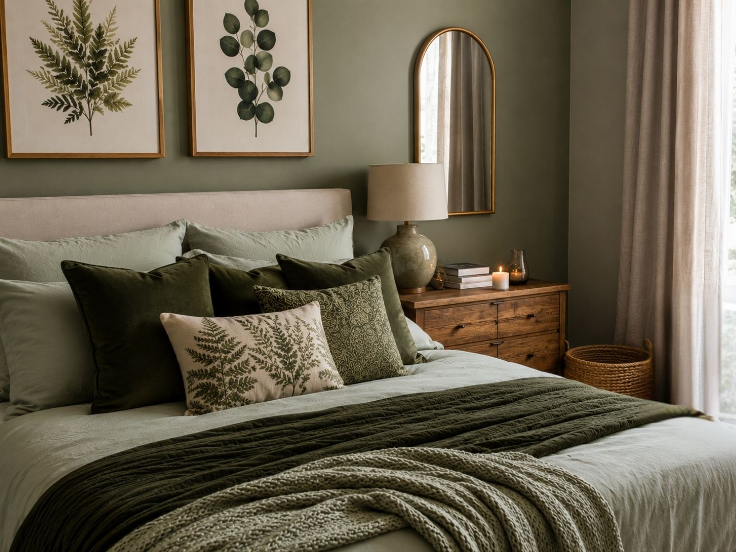
| Sage Green | 7 hours, 36 minutes | Evokes natural, biophilic harmony; minimizes ocular strain and visual fatigue. |
| Silver / Light Grey | 7 hours, 33 minutes | Provides a soothing, low-stimulus cocoon; ideal for individuals sensitive to visual noise. |
| Deep Purple / Red | Under 6 hours | Actively spikes fight-or-flight instincts, increases pulse rates, and triggers vivid, restless dreams. |
In a secondary study tracking insomnia-prone individuals, patients sleeping in blue environments fell asleep an average of 10 minutes faster than those surrounded by high-arousal red walls.
The Most Effective Tones for Better Sleep
1. The Blue Standard
Blue is universally backed as the king of sleep design. Deep navy tones work beautifully on feature walls, fabric headboards, and accents to help you decompress after demanding workdays. If you prefer a brighter layout, pale duck-egg or ice-blue shades introduce an airy, spacious quality perfectly suited to smaller floor plans.
2. Biophilic Greens
Earthy greens — from deep forest tones to light pistachio and sage — sync effortlessly with the natural world. Muted sage green is incredibly effective at reducing daily anxiety levels, providing a balancing backdrop that welcomes relaxation.
3. Grounding Neutrals
Warm taupes, soft beiges, and off-whites offer a clean backdrop without the sterile, blinding glare of pure brilliant white. Light greys create a beautiful, protective ambience that isolates you from external sensory stimuli.

Pictured: A cosy, minimalist wellness bedroom with warm sand-coloured walls. A solid oak wooden bed frame is layered with natural oatmeal and olive-green linen bedding.
How to Apply Colour Psychology via the 60-30-10 Rule
To prevent your bedroom from looking visually chaotic or completely flat, professional interior designers utilize a structured proportional distribution formula:
- 60% Dominant Tone (The Canvas): Dedicated entirely to your primary wall colour and large carpet layouts. Stick to flat, matte paint finishes that absorb ambient light.
- 30% Secondary Shade (The Anchor): Applied to your curtains, large area rugs, and your primary bed frame upholstery. This anchors the room’s core furniture pieces.
- 10% Accent Pigment (The Detail): Reserved for scatter cushions, artwork details, and bedside lampshades. This is where you can inject hints of warmer, complementing metallics or richer tones.

Pictured: Giltedge Beds Solo Master 4FT 6 Double Divan Bed, Plush Silver Fabric. (Bedstar, priced £349).
Layering Lighting to Maximize Colour Performance
A paint swatch that looks incredibly relaxing at noon can become harsh and uninviting under the wrong artificial bulb at 9:00 PM. To protect your sleep cycle, configure your lighting architecture using this sequence:
- Maximize Natural Exposure: Daytime Prep.
Keep window dressings open during daylight hours to let natural light bounce off warm neutral or pale white walls, helping to sync your cortisol production.
- Drop to Warm Kelvin Ranges: Sunset Transition.
As evening falls, completely turn off cool-white overhead lighting. Switch to bedside lamps fitted with warm-white LED bulbs sitting strictly between 2,700K and 3,000K.
- Deploy Dimmer Controls: Melatonin Trigger.
Utilise dimmers or low-power accent lighting to drop ambient lux levels below 10 lux in the hour before bed. Warm amber, orange, or low-intensity red tones do not disrupt your circadian cycle, facilitating rapid melatonin secretion.
Creating Lasting Environmental Balance
Your bedroom should remain an authentic personal retreat. Avoid the temptation to follow short-lived, high-contrast interior design trends that don’t support your physical recovery.
By investing in high-quality, stable bed frames, opting for low-glare matte finishes on your walls, and managing your lighting temperatures, you build a space that actively works with your biology. A better night’s sleep might simply be a fresh coat of paint and a premium bed frame upgrade away.